Tuesday, August 19, 2008

Neither for...

Neither for promotion, nor for fame...

Just to understand CB i played this game!!

Luckily I’ve got some live examples of the entire process of logo designing with me. Our first example would be the logo for ‘Sewa Bazaar’. This already included the concept definition based on which the logo had to be designed and it was: “SEWA’s vision of setting up SEWA BAAZAR, is to professionalize the informal vegetable sector by connecting the marginal growers and street vendors to the mainstream markets, with the objective to provide platform & support to these people (growers & vendors) in the evolving economy, and to prepare them for the new market challenges”

The logo that was created based on the requirement was:


Analysis of the logo is:

Here is a self reliant and autonomous woman… bringing the freshness and purity of nature filled in her basket… straight to the same old city but in an unconventional way. She is an emerging professional who knows how to earn with dignity and pride. And the reason of her confidence is… SEWA BAAZAR.

Another logo:


Analysis: If in your weirdest dreams you can impersonate the alphabets of the English language, the alphabet C would surely stay miles away from the student fraternity of IIM Kozhikode. We have this tendency to brutally replace this poor character ‘C’ with our beloved ‘K’ from any good adjective. The logo here which was created in a hurry so as to allow the fund gain the “first mover’s advantage” is a simple representation of the word itself. The tag line cleverly associated makes it a decent fit for the mutual fund. Let’s hope that it will really ‘sky rocket’ the money even in this tumbling scenario. All the best!!

This is the last entry of my academic blog but since I’m so much into it now that I’ll anyway keep it updated and will definitely try bringing more of the original creations and my own observations. Many of the logos which I’ve used in the blog might be someone’s copyrighted material and I kindly request those ‘creative’ people to provide me their details and I’ll duly provide them their credit.

Cheers!!

Logo Parodies

Logo Parodies... why are they done??
Protesting, ridiculing or just for Fun!!

There is a category of people… who are either very creative or they have ample time at their disposal. And when such people start performing biopsy/autopsy of famous logos what results is really funny. This fiddling around with concepts and themes isn’t restricted to movies and songs but is also coming up in a big way in logos. In this post we’d look at some of the very funny spoofs/parodies of the logos.

As a starter have this:


Although the logo is not that much played around with, but the punch line ‘Just do it’ has been really ripped apart in many instances. Some of the very famous versions are:

Just did it

Don’t do it

Do Justice

Just duet

Just do me

Some of the others are:


If we try and analyze the reason behind this spoofing of logos we’ll find that most of the times it is because of some controversy in which the brand landed up. For example, Nike is infamous for the child labor and abysmally low wage paid to the labors in Southeast Asian countries; Starbucks got severe criticism for anti competitive tactics, labor disputes, Ethos water controversy, Recycled paper cups which were never used for steaming hot beverages to name a few; Enron’s scam is something we already know about.

So Logo parody is one of the way people protest against the unlawful practices that the organizations get involved into or demonstrate their anger towards substandard products or services.

One very recent and absolutely hilarious example of this kind of demonstration is depicted in the pic below. It’s about Beijing 2008 Olympics.


Bad, Ugly and Yuckkk!!

Bad, Ugly and Yuckkk!!

Well there are always two sides of a coin. If there’s something good… there will surely be evil… the yin yang you see. So if I have talked about some of the best designed logos, I’ll have to dedicate a post to one of the worst ones as well. You’ll surely be surprised to see that these logos are actually in (or was in) place. May be the designer had something else in mind or maybe it’s just that I’ve a dirty mind … LOLZ.

Well some of them (Category # I) have ‘phallic’ connotations and I know that there’s absolutely no need to describe such logos because you all are smart enough (pun unintended). Then there are some of those (Category # II) which are really pathetic and have no such ‘exciting’ connotations… how boring!! Well I think that this happens mostly because the designer was not paid enough or was not given enough time (which usually happens with the M@Ddies @ K). Let’s have a look at some of them:


‘Ohhh Come on… it’s a pediatric center. The one on the left is a kid.’

I know… the more I’ll try to pull in the right way… the more eager you’ll be to go the wrong way. After all that’s what is the consumer behaviorJ. (Category # I)


Looks childish isn’t it?? A software company with such kind of logo… seems weird. But if I tell you that this logo is supposedly designed by the 6 year old daughter of the CEO of the company… will your perception change a bit?? I know you glanced at the logo once again and you were a bit considerate this time… weren’t you?? (Category # II)


Now this one is truly miserable. I just cannot expect such kind of logos for events as big as the Olympics. How do you connect it to the event or to the place or even to the year? Yes.. It’s 2012. At least I was not able to guess that it was 2012 written until I came to know that this logo is proposed for the next Olympics. (Category # II but your creative imagination may well take it into Category # I)


Aweful… that’s the only word that pops up when I see this logo. I hope you won’t differ. (Category # I)


And the last but class apart is the logo of ‘Brazilian institute of oriental studies’. A hut with sunset in background or is it…

Monday, August 18, 2008

Crea-THREE-vity Incoporated

Crea-THREE-vity Incoporated

Undu??


Now I’ve no idea what so ever about this brand but since I need not write about that in this blog… I don’t care. Again, this is an example of simple arrangement of alphabets to give it a meaning. The graphic looks like just a shape until you realize that it has been created using the same alphabets which the name has. The color combination plays a significant role here.


Although seems to be very simple but it represents the intended thing very beautifully. This is the logo for Michael Schumacher. With his initials MS the artist has tried making a F1 car. And that dot above his it is I guess his helmet. This F1 champ deserves it J

Google Doodles


Google is famous for its simplicity in representation and creativity and innovation in products and services that it offers. The logo itself is quite simple and colorful. Don’t worry… I won’t put the GOOGLE logo in the list of creative logos and you can check out the numerous versions of Google logos at http://www.google.com/holidaylogos.html

But what’s really creative is the ‘Doodle’. The various kinds of modifications of the official Google logo, on occasions ranging from birthdays of famous people, holidays and major events, are known as the Google doodle. It started off with Larry page and Sergey Brin designing a logo to notify their absence to the users in case the servers crashed. It was in reference to the ‘Burning Man festival’.

Many of the following doodles were created by some outside contractor until Google stumbled upon Dennis Hwang in 2000. Right after that day, Dennis has been after all the doodles and has created around 200 of them. I came to know that they also entertain requests about doodle for great personalities and so I tried searching for one dedicated to ‘Mahatma’. Since I didn’t find any… I thought of creating it myself.


Please tell me that you like it. I know it’s quite simple but then… ‘The simpler… the better’ ain’t it?? I’m gonna request them to put this or something similar to this on 02nd of October and if that happens… I’ll get registered in the Google history. Wish me luck!!

Creativi-TWO Incorporated

Creativi-TWO Incorporated

It won't be fair on my part if I do not talk about creativity in Logos in great details. And hence here comes one more post... dedicated to one of the most creative logos you can find:

Great 8:


I couldn’t find out much about the brand but the logo in itself is a stunner. Every character is carved out the digit 8 and that’s really great… ain’t it.

Pareto’s Eighty 20:


I know we all are aware of Pareto’s principle- the 80/20 rule which is also known as the ‘law of vital few’ and ‘principle of factor sparsity’. It states that for many events 80% of the effect comes from the 20% causes.

‘Eighty 20’ is a South Africa based consulting company which boasts of creating new and innovative ways of accessing international consumer data. Involved in complex database work which includes highly quantitative analysis and serious computing, the logo is an excellent representation of this work.

If you think it’s just that 20% of the cells in the logo are shaded and 80% are not then… think again. The funda here is to replace all the shaded cells with 1s and non shaded cells with 0s. What you get after doing that is: 1010000 0010100 which is the binary representation of 80 & 20 respectively.

They also have a nice collection of ‘Amazing facts’ which are no way related to the logo or my blog but since I stumbled upon it, I’d like to share it with you all. Visit http://www.eighty20.co.za/databases/index.cgi

Logo fever- Unilever


This new logo tells the story of Unilever and its vitality. It brings together 25 different icons representing Unilever and its brands, the idea of vitality and the benefits we bring to consumers and the world we operate in. For example:

The Sun is our primary natural resource. All life begins with the sun — the ultimate symbol of vitality

The Heart represents love, care and health — feeling good

The Shirt represents fresh laundry — looking good

A Bird is a symbol of freedom. Relief from daily chores — getting more out of life

Creativ-1-ty Incorporated

Creativ-1-ty Incorporated

Ladies and gentleman, Girls and boys… this probably is going to be the most attractive post of the blog. Here I’ll explore the world of creative logos. Many of them might have already been through your scanner but let me assure you… I’ll give it a very serious effort to gather the best of the class logos which are considered to be the epitome of creativity.

We’ll start this saga with a simple one: Fed ex


Description- The negative space between the E and x gives rise to an arrow which can be interpreted as the symbol of accuracy, precision and speed. Don’t know whether this can fall in the ‘subliminal’ category or not.

And since we’ve started talking about subliminal things, I’d like to add to the list another entry. A retail giant, Carrefour, whose logo is usually perceived as one with two distinct parts. But have a look once again and you’ll see that that what you thought was an empty space… is actually not!!


Amazing Amazon:


Now this logo is a real beauty. When you just look at it without trying to interpret, you’d see just another-dot-com-company logo. But if you are looking at it after watching ‘The prestige’… which reiterates the same question a dozen times “Are you watching closely?” you’d realize that this logo has a smile which might suggest that they will make you smile. And not only that… the smile is also a pointer which originates at ‘a’ and terminates at ‘z’ signifying that they have everything a-to-z.

Wasn’t that cool!!

Symmetric SUN:


A marvelous example of symmetry, this logo is truly spectacular. The characters u and n are written in such a way that they create the effect of S. So no matter which way you turn the logo, you’ll always be able to read ‘sun’. Now that’s fun J

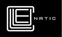
Cryptic Cluenatic:


Not so famous, this logo represents a puzzle game with four clues to crack it. The first four letters C, L, U and E are arranged in a shape of maze and if seen from a distance the entire logo appears to be a key.

Sunday, August 17, 2008

Look alikes

Look alikes

In this post we’ll talk about logos having noticeable similarity. In Indian context you must have seen many a logos which are apparently exact replica of some of the most famous brands. Take a stroll in the palika bazaar at our nation’s capital and you’ll be delighted to see the unimaginable low price of the till-now-unaffordable products ranging from deodorants to apparels and shoes. Well, since we are not talking about piracy here, we won’t discuss this case here and with the ‘copy right’ laws slowly gaining popularity in our country as well; we’ll hopefully get over this cheap piracy pretty soon.

What I am interested in is the similarity of this type:


What can we say about this striking resemblance?? Is it intended or unintended? Is there any way of checking out whether my logo is not very similar to another? There are no concrete answers to these questions. It is the moral responsibility of the designer to take care of such stuff. As already mention in one of the earlier posts, ‘uniqueness’ of the logo is very important. But then there are those people who say that it really doesn’t matter how closely your logo resembles the other (until and unless it is an exact replica) if you’ve taken care of the fact that the other one is not in your product category. Supporting this viewpoint they also say that many of the organizations do not have global presence and hence there is no particular need to look beyond your area of operation. This way you can significantly reduce the number of logos you need to be aware of.

Because of all this the concept of trade marking your logo comes into picture. It requires many additional considerations then registering a trademark that is merely a slogan trademark. To trademark a logo a design search has to be performed for the trademark or company logos. After that a trademark lawyer should review this design search to ensure that your trademark logo does not infringe upon other trademark logos. Your trademark attorney can then advise you on whether it is safe to proceed with your plan to register the company name as a trademark. Simple, isn’t it.

Moreover, free trademark logos may be available on the Internet but most of the times they won’t be able to reflect the qualities of your product or company.