Ladies and gentleman, Girls and boys… this probably is going to be the most attractive post of the blog. Here I’ll explore the world of creative logos. Many of them might have already been through your scanner but let me assure you… I’ll give it a very serious effort to gather the best of the class logos which are considered to be the epitome of creativity.
We’ll start this saga with a simple one: Fed ex
Description- The negative space between the E and x gives rise to an arrow which can be interpreted as the symbol of accuracy, precision and speed. Don’t know whether this can fall in the ‘subliminal’ category or not.
And since we’ve started talking about subliminal things, I’d like to add to the list another entry. A retail giant, Carrefour, whose logo is usually perceived as one with two distinct parts. But have a look once again and you’ll see that that what you thought was an empty space… is actually not!!
Amazing Amazon:
Now this logo is a real beauty. When you just look at it without trying to interpret, you’d see just another-dot-com-company logo. But if you are looking at it after watching ‘The prestige’… which reiterates the same question a dozen times “Are you watching closely?” you’d realize that this logo has a smile which might suggest that they will make you smile. And not only that… the smile is also a pointer which originates at ‘a’ and terminates at ‘z’ signifying that they have everything a-to-z.
Wasn’t that cool!!
Symmetric SUN:
A marvelous example of symmetry, this logo is truly spectacular. The characters u and n are written in such a way that they create the effect of S. So no matter which way you turn the logo, you’ll always be able to read ‘sun’. Now that’s fun J
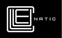
Cryptic Cluenatic:
Not so famous, this logo represents a puzzle game with four clues to crack it. The first four letters C, L, U and E are arranged in a shape of maze and if seen from a distance the entire logo appears to be a key.


No comments:
Post a Comment